Smells Like Oranges
The goal of this project was to create a typeface using household items. A lot of testing was done with different fruits, like bananas, apples, and grapes. Oranges were chosen because their peels were easy to work with. The final result was a colorful display font named “Smells Like Oranges,” reminding people of the smell in a classroom when a student peels or eats one.


Fried Food Fest
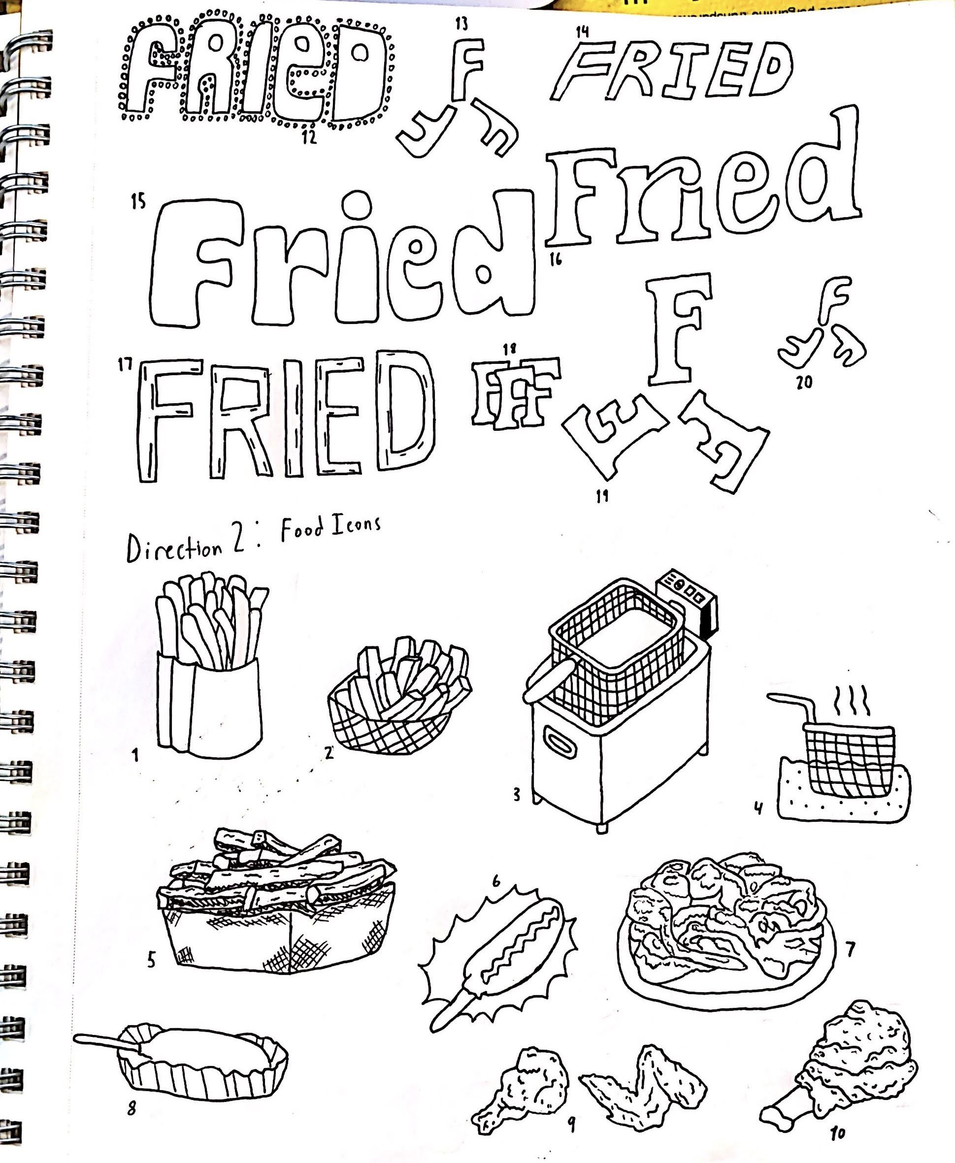
The objective of this project was to create a flyer for an imaginary festival (food festival, music festival, movie festival, etc). We were tasked to create a logo for our imaginary event and also put together a brand guide for it. I chose to do a “Fried Food Fest” because when I thought of fairs or festivals I thought of the crazy fried foods that most of them have such as fried butter, fried gum, fried ice cream and more. The end result was a fun, eye-catching poster with hand-rendered type.

Brand Guide

Initial Sketches